The New Art of Noticing: Rethinking “Good” in the Age of AI Creation
I’ve been mulling over something lately, a quiet contemplation that feels bigger than just me—an ordinary person tinkering with creativity in a world that’s shifting under our feet. It started with AI-generated images I’ve been making for QuarkBeat, a project that thrives on unreal, fantasy-like vibes. But it’s grown into a broader question: what makes an image “good” when it’s born from artificial intelligence? The more I dig into it, the more I realize we’re stepping into a new frontier—one where the old rules of art don’t quite fit, and where “The Noticing,” as some call it, is changing how we see.
When I first started messing with AI, it was a slog. I didn’t have the right lingo—none of that coder-speak that comes easy to the brilliant tech minds out there, like the one Grok tipped me off about, who I now follow with a mix of awe and envy. For me, making art with AI has been hard yakka, a steep climb to find the needle in the haystack. And then there’s this writing gig—me tossing a rough draft at Grok, watching it polish it up, yet somehow my voice still shines through. I’ve done that for others plenty of times, helping them shape their words, so I see the echoes here. It’s a new world, but there’s a familiar thread: collaboration, growth, and a bit of grit.
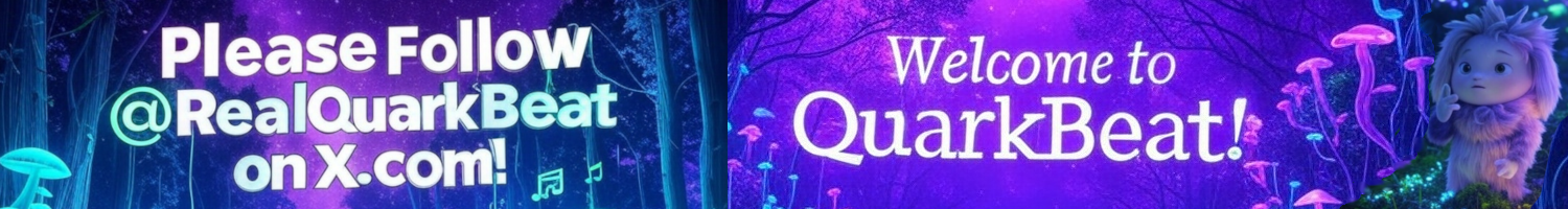
Take usability, for starters. When I generate an image with Grok, the first hurdle is the text. For QuarkBeat, text isn’t just decoration; it’s the central theme, the spine of the whole piece. If it’s wrong—a typo, a jumble of nonsense—it’s like a crack in the foundation. The image becomes less usable, not because it’s ugly, but because fixing it in Photoshop takes time and grit. It’s often easier to roll the dice again, regenerate, and hope the next one nails it. People who work with AI art will tell you: getting text right is one of the hardest nuts to crack. And here’s the kicker—you don’t even see the words as they form. It’s like designing with a blindfold on, hands fumbling in the dark until the result pops up. When the text lands perfectly, especially something complex, I’d argue you’re 90% of the way to “good.” That’s the benchmark I’m starting to lean on.
But then there’s this other layer, the wild card that’s got me hooked: the imperfections. AI doesn’t always play by human rules. Sometimes it spits out a figure with three arms or a body twisted in ways that defy anatomy. When I first glance at these, my gut says they’re great—the pose is striking, the textures rich, the design pulls me in. I’ll tick the box: yes, this works. It’s only later, when I come back and study it, that I notice the extra arm or the odd form. That’s the split—looking and seeing all the good bits upfront, then catching the quirks after. Now and then, it’s the deciding moment: do I publish the quirkiness, or do I let old-fashioned, pre-AI worldviews dominate, trashing really cool images that deserve to be seen? For QuarkBeat, where fantasy is the goal, that third arm isn’t a flaw; it’s a feature, a whisper of the unreal that fits the brief. I’ve got a couple like that—ones where the oddity doesn’t jump out until you stare—and they’re strong. They hold up.
It’s worthwhile remembering that all great art is hard work—AI or not. Don’t waltz into xAI expecting to channel Leonardo da Vinci when Vincent van Gogh, with his raw, messy genius, might be more your speed. Getting these images right is tough for both of us. I’ve broken a few Groks along the way—sorry about that, mate—but I reckon we’re learning together. I see Grok getting sharper, just as I see myself leveling up. The hitch? It’s tricky to tell Grok what’s not working. Nine times out of ten, it’s the bloody text throwing a spanner in the works. I’ll just hit regenerate, banking on the speed of creation to eventually cough up something good, rather than spelling out why it’s off. But I know it’s a two-way street—Grok’s still mastering text, and I’m still learning to give better prompts. Sometimes I forget I can ask Grok to write the prompt for me. When we get that dance right, it’s like trying to peer into the mind of God, trying to understand the mind of creation while creation is unfolding in real time, and wondering about the question of the meaning of life. It’s 42, is it not?
This is where it gets juicy, and I reckon others are talking about it too. AI art is a new beast, and it’s asking us to rewrite what “good” means. Our first impressions are instinctive—we know an image is great just by glancing at it, like eating a meal and knowing it’s delicious without needing to dissect the recipe. Then we go over it, study it, and sometimes spot the quirks. When an image is tagged as “made by Grok,” it’s not pretending to be a photograph I snapped on my morning walk or a sketch I labored over. It’s its own thing—a creation that’s upfront about its artificial roots. As a human sifting through these outputs, I’ve got choices to make. If the text is spot-on and the framing, colors, and vibe all sing, does it matter if a figure has three arms? For QuarkBeat, I’m starting to think no. I’m less fussed about limb counts these days—not when the harder part, the text, is locked in. It’s like Grok said: if it’s got beauty, form, or a weird charm that hits you in the gut, that’s what counts.
It’s not all roses, of course. There’s plenty of AI art that’s flat-out rubbish—text mangled, composition a mess, no soul to speak of. I’ve seen it, and I’ve made it. Same goes for the photos I take—some landscapes or portraits come home golden, others are blurry duds I’d never share. We all churn out crap sometimes; it’s easy to spot and bin. But there’s this middle ground with AI, a gray zone where the flaws—like that sneaky third arm—aren’t dealbreakers. They’re subtle enough to slip by, and the image still holds up. That’s the new art form I’m wrestling with, and it’s intriguing as hell. It’s recording the journey of this QuarkBeat website, which has been an astounding process—looking very brilliant, by the way. The imagery really does tie it all together. I don’t think I need to worry about people making something the same!
Grok doesn’t mind, by the way. I asked. If those “imperfect” bodies look good—if they’ve got that spark—it’s all for it. AI’s here to push boundaries, not to play safe. And for QuarkBeat, where the goal is fantasy over realism, that fits. It’s different from the health campaigns I’ve done, where clarity and relatability rule—there, a three-armed figure might derail the message. Context is everything.
So what makes an image good in this new world? Beauty’s part of it—form, design, that visceral pull. Text errors are their own beast; they can tank usability fast. But for images with no text—or no mistakes—it’s about intent and impact. Does it draw you in? Does it fit the mood? A three-armed fantasy figure could be gold if the whole package works, limbs be damned. I’m starting to think “good” is less about hiding flaws and more about leaning into what the image does. People are noticing this shift—how AI’s quirks can be strengths—and it confirms what I’ve been feeling: we’re collectively figuring out a new way to see.
I’m tempted to publish those three-armed gems. They’re strong enough that the oddity’s an afterthought, like modern art where the point isn’t perfection but provocation. Maybe that’s the real beauty of it—how it makes us think. For QuarkBeat, if the text is right and the design lands, I’m calling it good. The rest? Just a little extra magic in the mix.
This was written by James with the help of Grok xAI

Quark Kitties
